
Written By:
Every year Pantone (the authority on color, provider of color systems and leading technology for accurate communication of color) releases its “Color of the Year,” representing a snapshot that is connected to the pulse of the current mood or climate of our culture. This year’s color choice of Greenery could not be more clear: we all long for a fresh start and new beginnings.
Since I was a child, I have always felt an innate need to escape to nature in order to find inspiration, to feel solace and to seek peace. I feel closest to God when I am outdoors – I find being active in nature to be a celebratory experience of God’s creation and the gift of life everlasting that He has bestowed upon us.
I am most calm when in the woods and the most meditative experiences of my life have occurred while hiking outdoors in the spring – when the grass and leaves are green and the morning air is fresh and crisp. There is something about being surrounded by lush greenery that feels inherently pure and fresh. Upon first looking at the Greenery color swatch, images of Spring immediately came to mind; a sign of rebirth and renewal. A fresh start. A peaceful feeling. Even solitude – a time for reflection. And, as Emerson notes, patience.
Perhaps this is what we as a society currently long for during the tumultuous political, social and economic environment that we live in – the feeling of warmth and ease one gets when stepping outside, surrounded by God’s green earth; a deep breath of fresh air filling our beings and renewing our spirit.

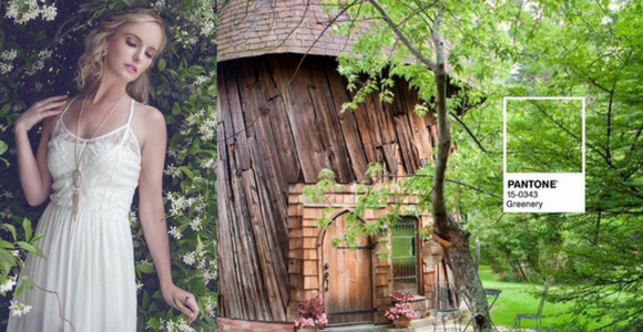
Photo Credit: Ewa Zuk – to see complete credits and more images click this link to our Garden Party, featuring beautiful, lush greenery in nature.
Greenery’s strong symbolism has struck a perfectly placed chord in present-day society. “Greenery bursts forth in 2017 to provide us with the reassurance we yearn for amid a tumultuous social and political environment. Satisfying our growing desire to rejuvenate and revitalize, Greenery symbolizes the reconnection we seek with nature, one another and a larger purpose.” – Leatrice Wiseman, Executive Director of the Pantone Color Institute.

Pantone describes the shade as both “refreshing” and “revitalizing,” noting that it “is a fresh and zesty yellow-green shade that evokes the first days of Spring when nature’s greens revive, restore and renew.” Greenery, they say, is “nature’s neutral.”

Fairhope Soap Company is on-trend, pairing the fresh and zesty Greenery in the handmade bars of soap, named Back to the Fuchsia, with an even brighter pop of color in the photo above. You can shop their soap and other bath and body goodies online or in downtown Fairhope – it is all vegetarian (or vegan if no milk), handmade, hand cut, hand trimmed, cured and made with organic ingredients – “Tested on friends, not animals.” – and makes for fabulous gifts with Christmas just around the corner.

This adorable children’s fringe bathing suit from Gigi’s Fabulous Kids’ Fashions and Toys in Rosemary Beach, Florida is a perfect example of how to mix Greenery with other bright colors to create a fun and funky look. Love the suit but don’t live in Rosemary Beach? You can shop their site and order over the phone: 888-353-6161.
If you love Greenery’s symbolism but do not know how to incorporate Greenery into your aesthetic, stay tuned! I am currently working on an article featuring Cotton+Quill owner Mary Catherine Folmar and Birmingham blogger Jessica Welsh, of White Oak and Ivy. The post will feature Greenery – nature’s neutral – used in both fashion and interior design and a “how to” on achieving the perfect Greenery look that fits your specific taste.
